Monolith
Success Stories / 004_

Downey’s Rebrand

Eighty-three years of honey folded into butter — wearing a label that whispered. We repainted the original loud enough to hear across the aisle.

ClientDowney’s Honey Butter
HeritageStacking flavors since 1942
ScopeConcept rebrand — identity, packaging, campaign
FlavorsThe OG / Cinnahon
01

The brief

Downey’s has been mixing honey into butter since 1942. The jar never said it like it mattered.

Three generations of breakfast tables know the taste. On the shelf, the brand read like a footnote — polite label, apologetic type, its one unbeatable fact buried in small print. The brief we set ourselves was simple and slightly rude: make the original honey butter look like the original. Louder than the syrup aisle, warmer than the butter fridge, and unmistakably 1942.

02

The one-line origin

Everybody thought you can’t beat butter at making food taste better. Downey’s beat it — in 1942, with honey.

That sentence is the whole rebrand. Nothing was invented, no story was bolted on — the volume was turned up on a fact that was already true and already older than most brands in the store. Every claim that made it onto the label predates the shelf it sits on.
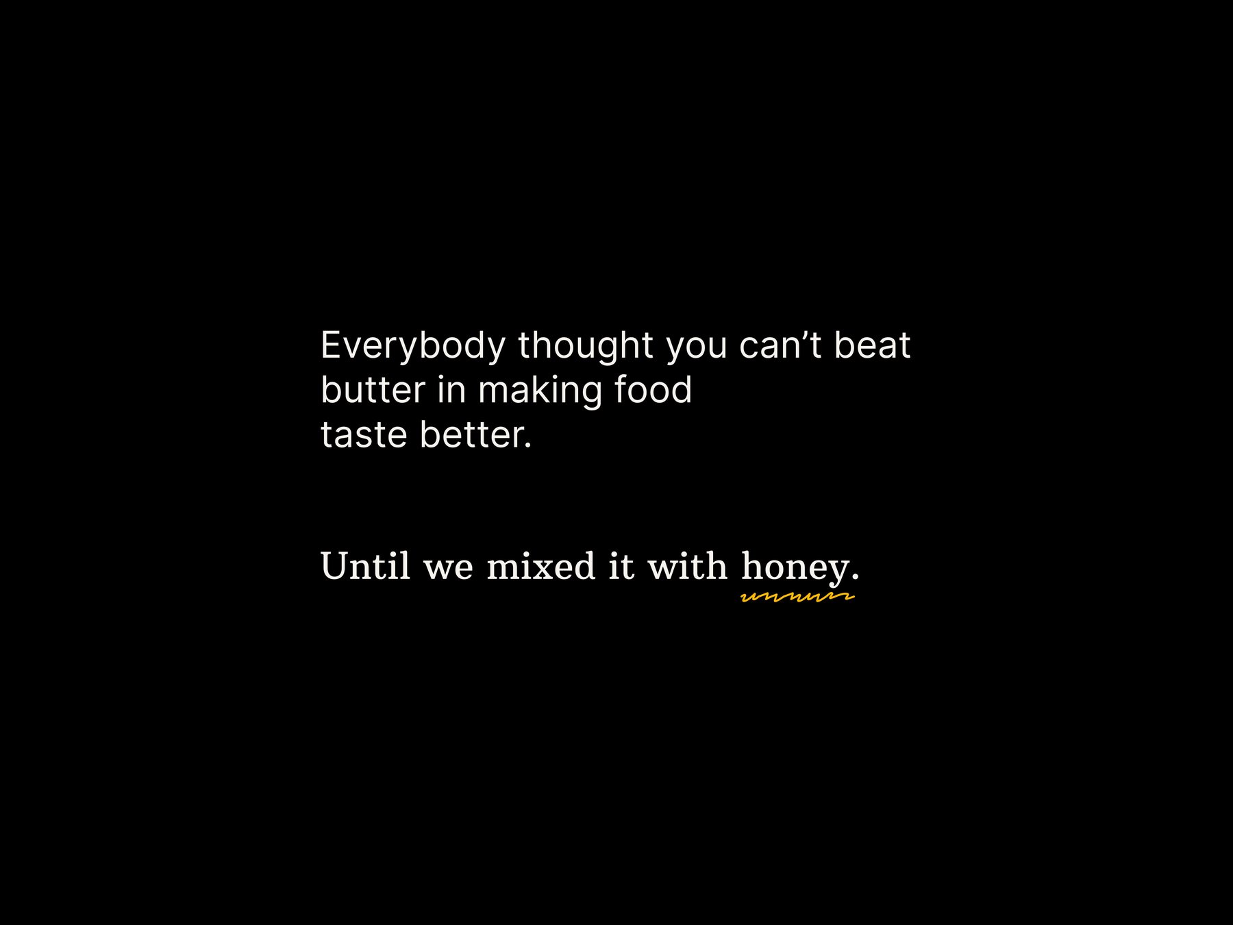
Black slide: Everybody thought you can't beat butter in making food taste better — until we mixed it with honey.
Fig. 01The origin, told in the campaign’s own words
03

The mark

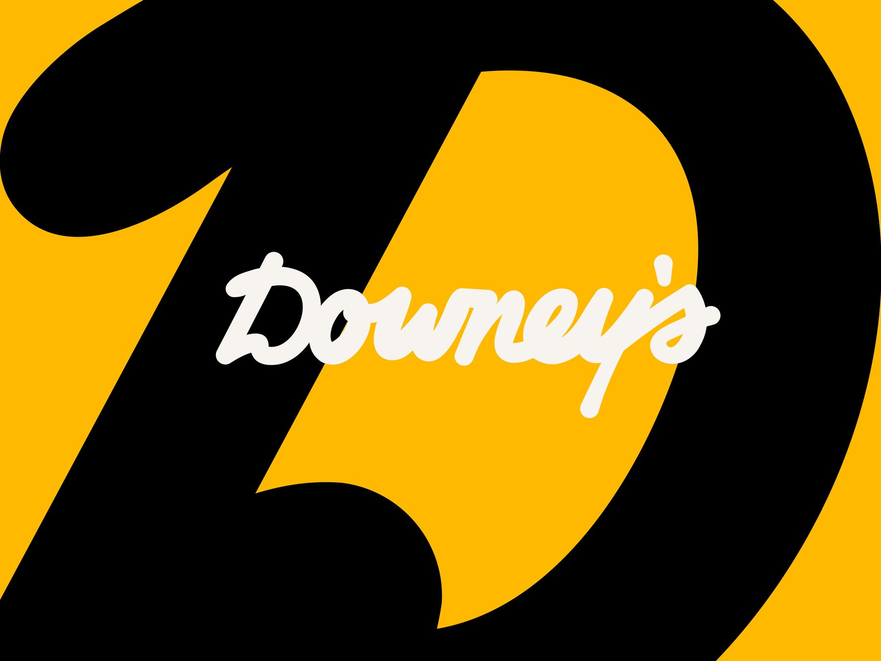
A founder’s-hand signature riding a D big enough to butter.

The script keeps the warmth of 1940s sign lettering — rounded terminals, buttered corners, a name written the way it would be signed on a delivery slip. Underneath it, the monogram: one enormous D, cut with a single knife-stroke, set in honey and black with no gradients to hide behind. Diner-sign confidence, drawn to survive a jar lid, a truck door, and a two-story wall.

The Downey's script wordmark over a giant black-and-honey D monogram
Fig. 02Wordmark & monogram — signature over knife-cut D
04

Stacking flavors

The system stacks like the product: honey on butter on toast.

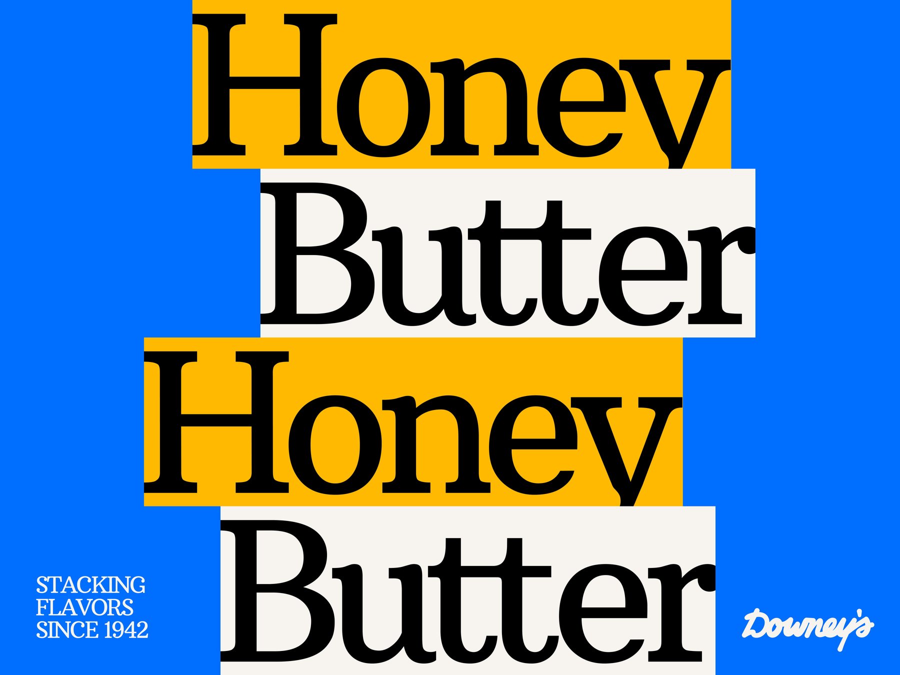
Type sets in slabs — cream and honey bars sliding off-grid like slices dropped on a plate, never quite aligned, always appetizing. And under everything runs the drizzle: a hand-drawn squiggle traced from the path honey actually takes off a spoon. It underlines the important words, scribbles across photography, and stands in for the product whenever the product isn’t in the shot.

Honey Butter set twice in stacked cream and honey type bars on electric blue — stacking flavors since 1942
Fig. 03The stack — slabs of type, dropped like slices
05

The voice

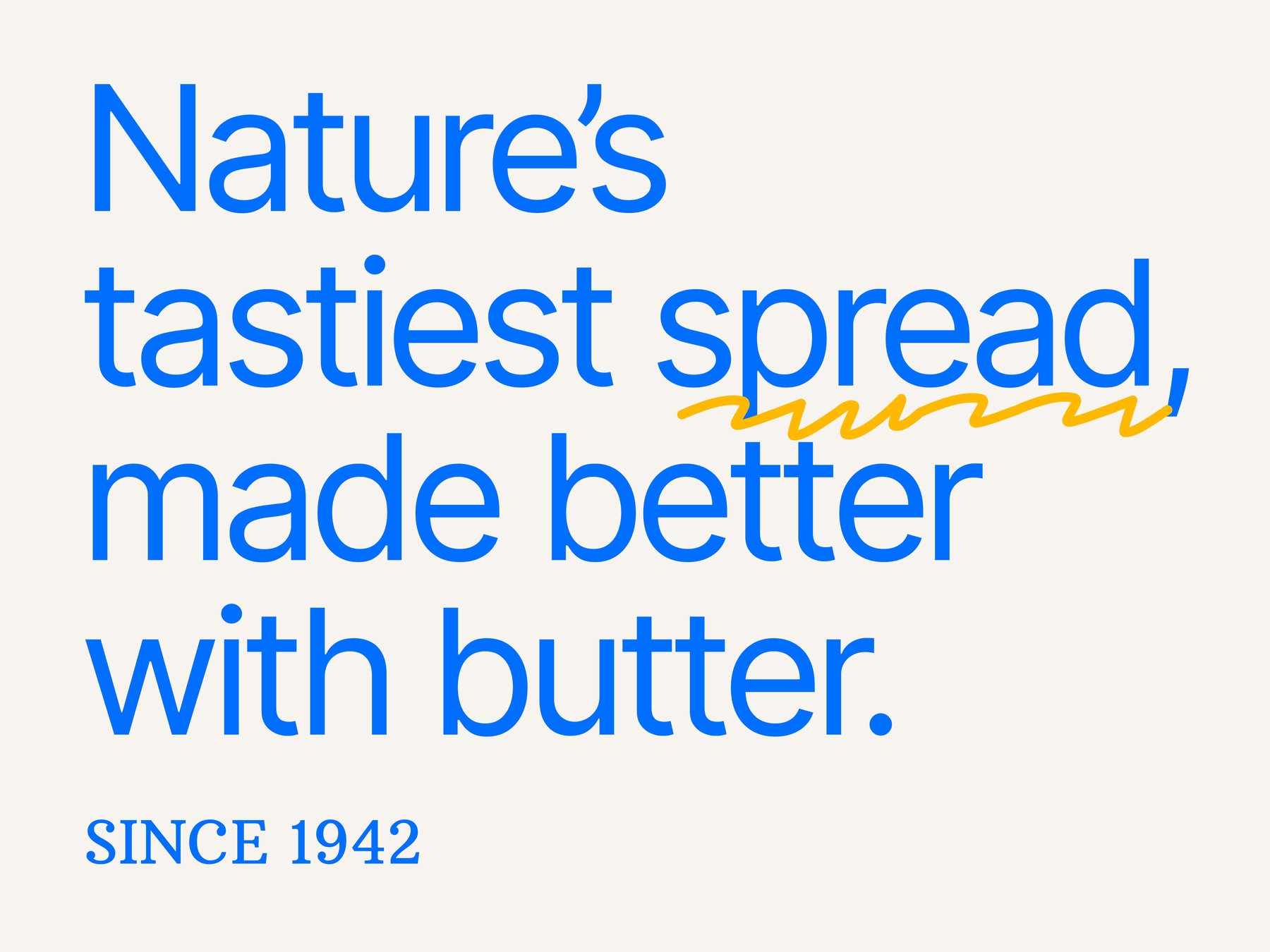
Nature’s tastiest spread, made better with butter. The voice states facts and lets them brag.

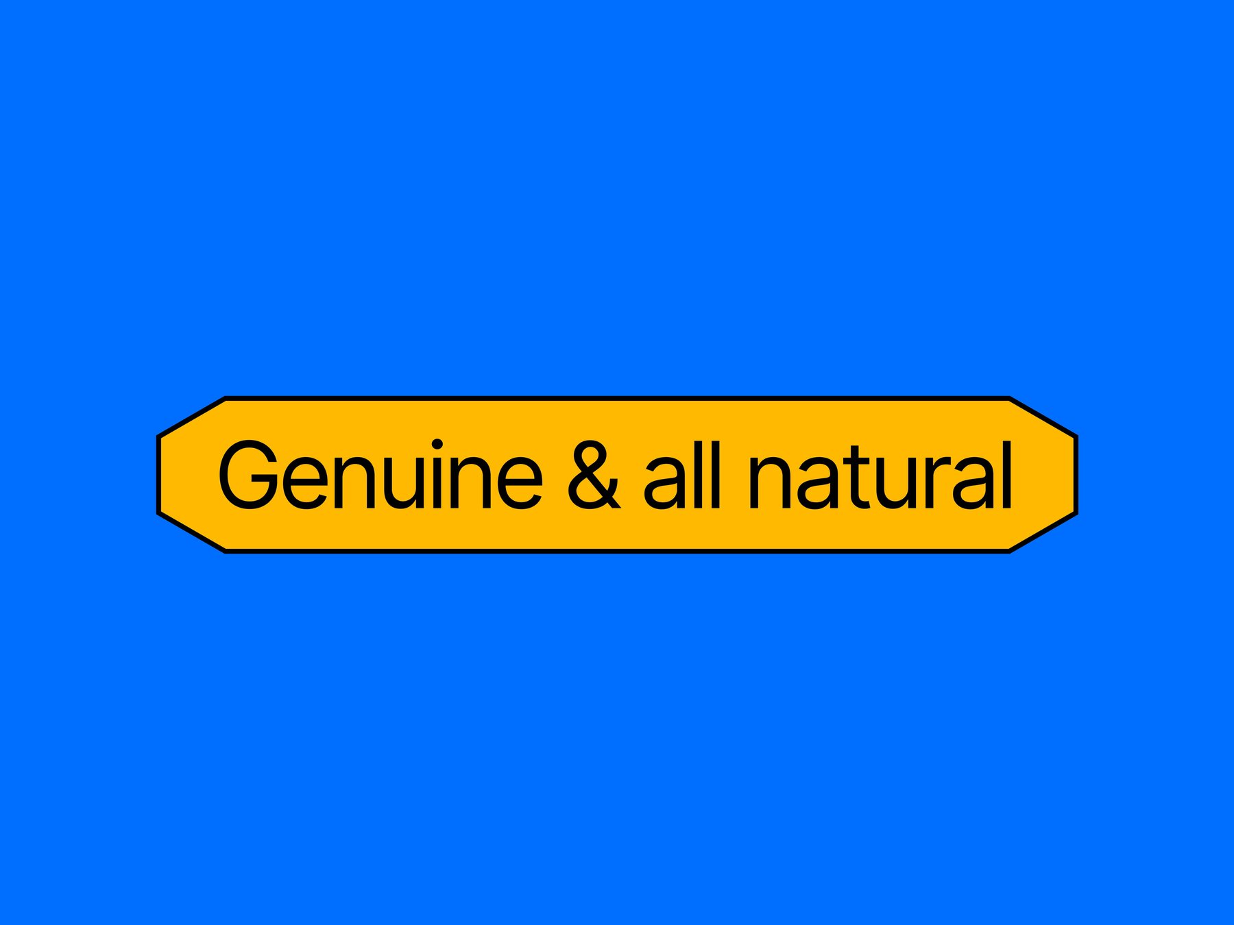
Plain-spoken Americana: short claims, no adjective the recipe can’t back. “Genuine & all natural” rides in a pill borrowed from roadside signage — the kind of badge that used to mean a place had the best pie for sixty miles. Nothing on the system sells; it testifies.

Nature's tastiest spread, made better with butter — since 1942, set in blue on cream
Fig. 04The manifesto — facts, bragging quietly
Genuine & all natural — the roadside-sign pill badge in honey on blue
Fig. 05The badge — best pie for sixty miles energy
06

Don’t drizzle.
Make it ooze.

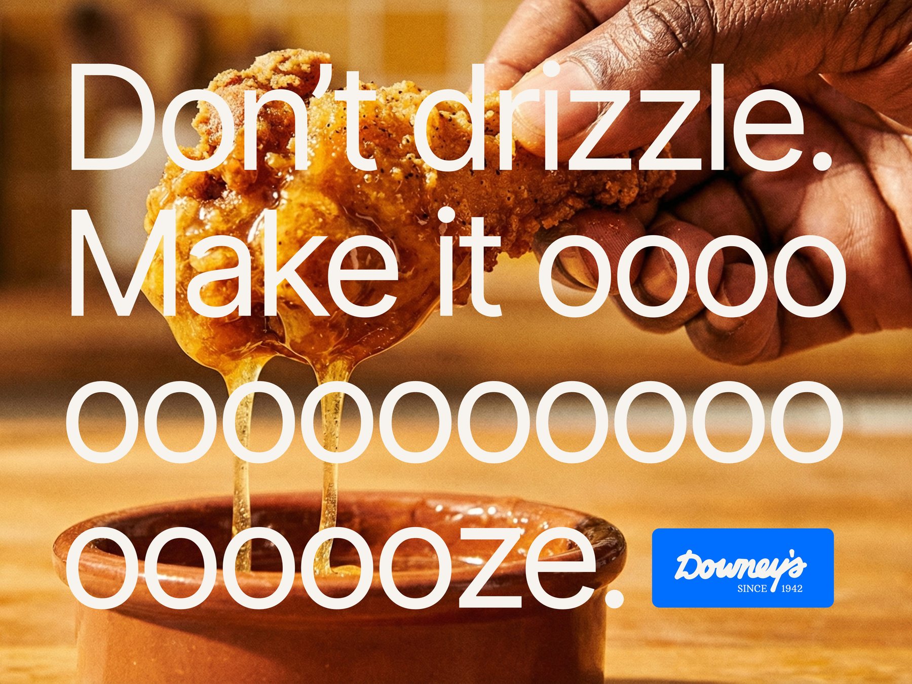
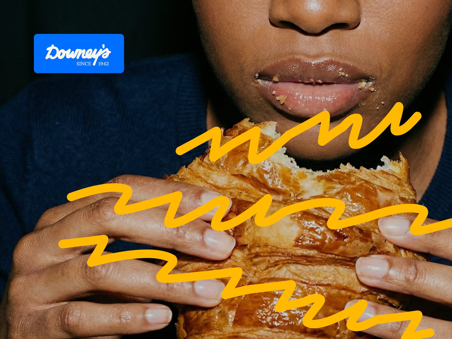
The campaign shoots the mess, not the plate. Honey mid-drip, crumbs on lips, the pull of a croissant photographed like a crime of passion — and over it all, the drizzle squiggle scribbling where the appetite goes. The line does the rest: eleven extra o’s of self-control, lost.

Campaign ad: fried chicken dripping honey butter — Don't drizzle. Make it ooooooze.
Fig. 06Key visual — the drip, mid-confession
Campaign photo: biting into a croissant, brand squiggles scribbled over the pastry
Fig. 07The squiggle goes where the appetite goes
07

The shelf

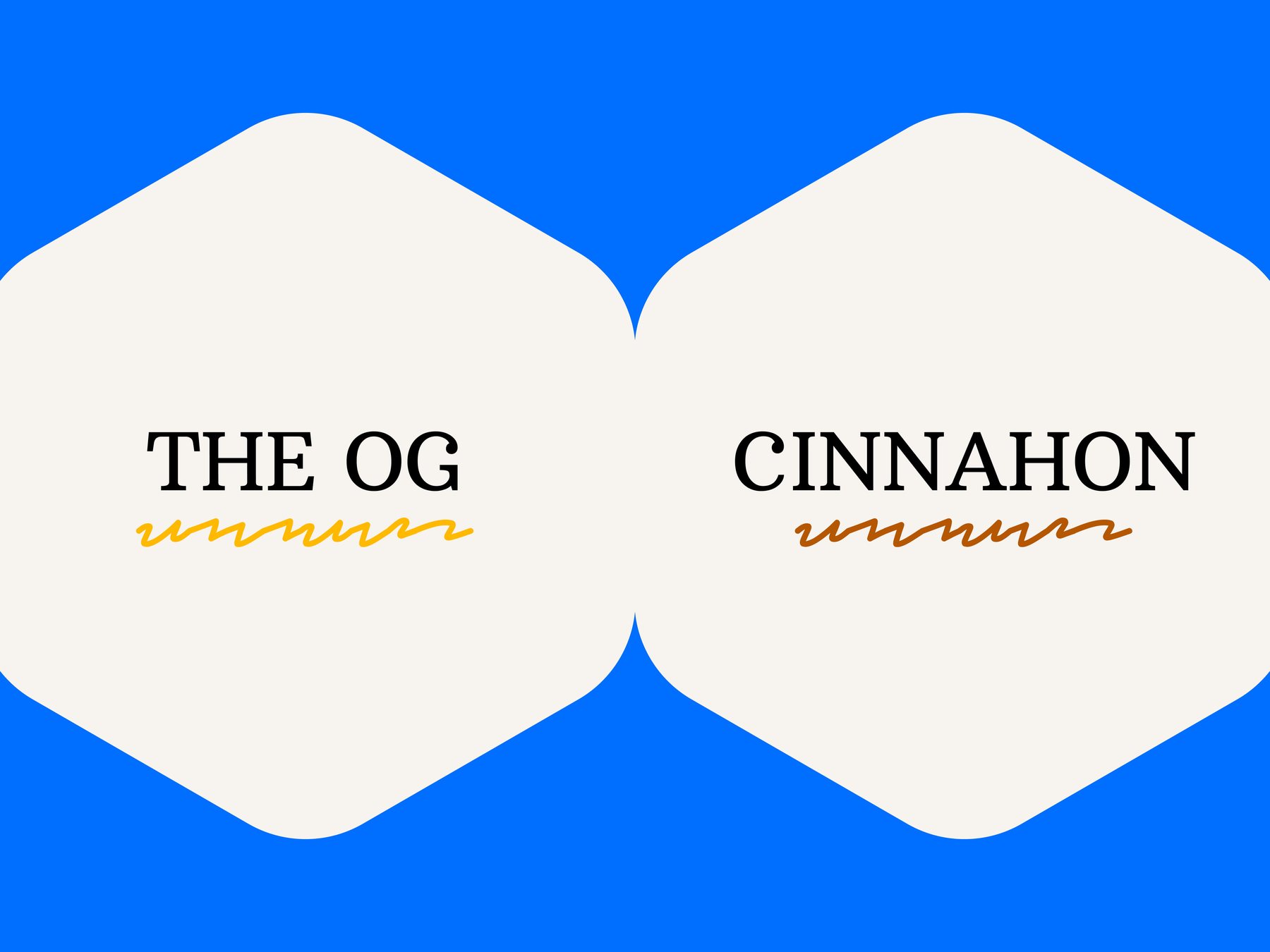
Two flavors at launch: The OG, and Cinnahon.

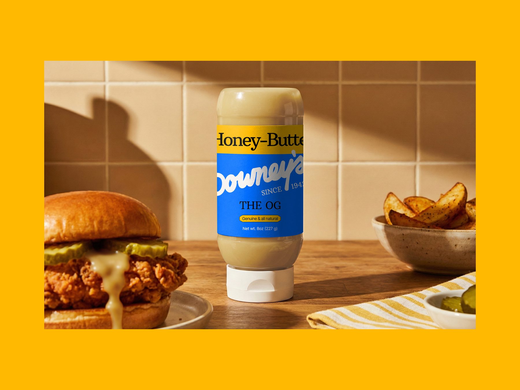
The label reads top-down like a menu board — flavor in the honey bar, signature in the blue, the plain-talk pill underneath swearing it’s all real. The OG is the 1942 recipe, untouched. Cinnahon folds cinnamon into the stack and keeps the pun as a bonus. Both wear the squiggle like a maker’s mark.

The OG honey butter squeeze bottle on a kitchen counter between a fried chicken sandwich and potato wedges
Fig. 08The OG — label as menu board
Flavor plates: The OG with a honey squiggle and Cinnahon with a cinnamon squiggle, on hexagonal cream tiles
Fig. 09The range — squiggle as maker’s mark

Stacking flavors since 1942_

Small print, said quietly: Downey’s is a concept rebrand. It was proposed, and it was not accepted. The work lives here because we still believe the shelf deserves it. All Downey’s trademarks remain the property of their owner.

← All success stories