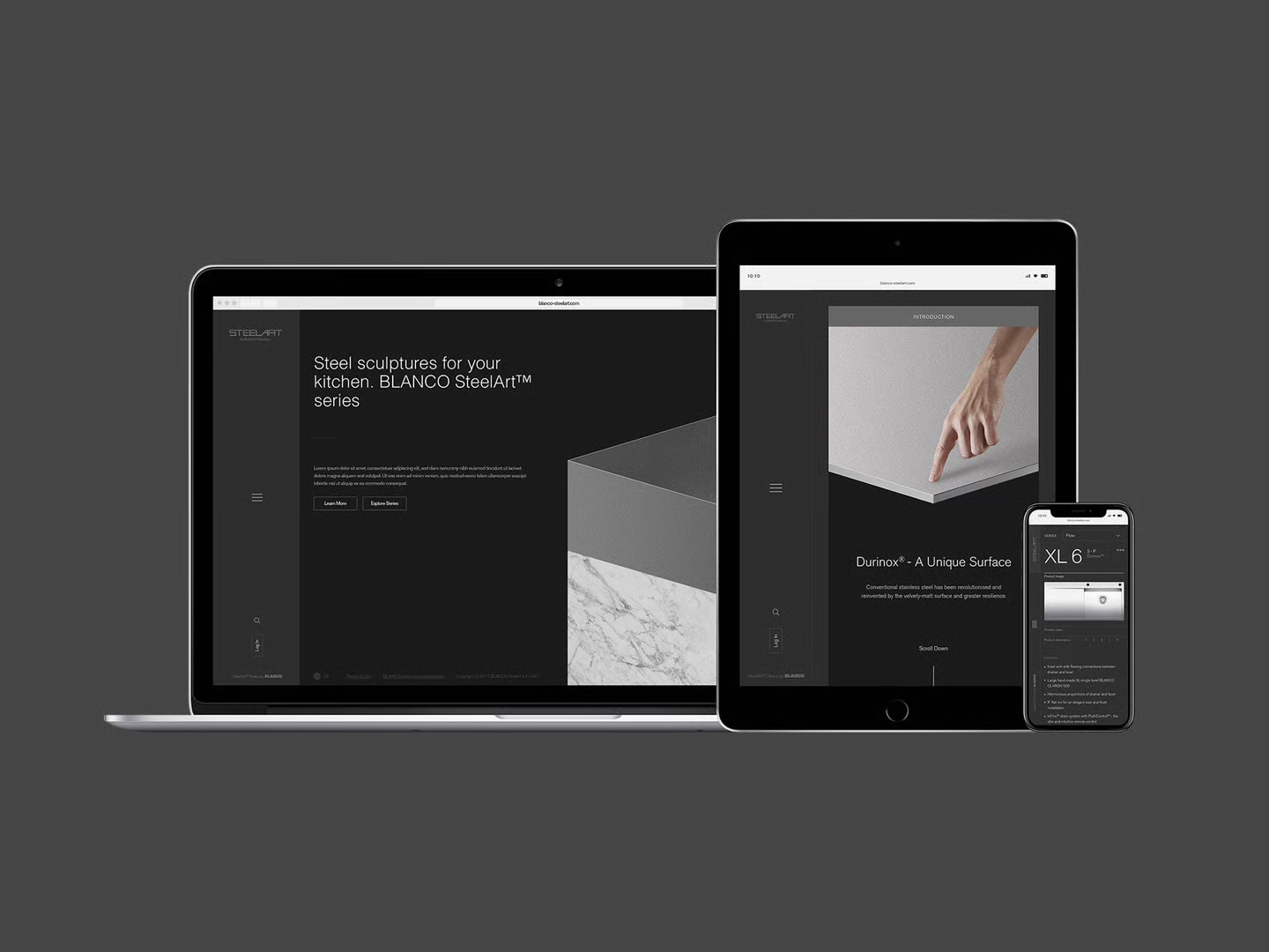
BLANCO has been pressing steel in Germany since 1925, and SteelArt is the best of it — sinks and worktops closer to furniture than to plumbing. They asked us to explore what its website could look like. Somewhere between the moodboards and the first wireframes, the real question surfaced: why is the company’s proudest steel filed away as a product line?
It started as a website exploration — moodboards, type tests, a homepage or two. The kind of brief a studio can do in its sleep, which is usually the sign to stay awake.
The brand strategy taskforce sat one room over, rethinking how BLANCO’s brands relate to each other. A background in architecture earned us a seat in that room: the audience SteelArt needed wasn’t “people shopping for a sink.” It was the architects and interior designers who decide which sink gets drawn into the plan — months before anyone shops for anything. So the UI directions came with us, and the engagement grew into strategy work.
A sink like this isn’t bought. It’s specified.
On paper, SteelArt was one row in a catalogue, filed between colour ranges and accessories. In the field, architects were already treating it as a marque of its own. The strategy’s job was to catch the brand up to its audience.
We proposed moving SteelArt from product line to aspirational sub-brand: its own wordmark, its own voice, its own address — with BLANCO stepping back into the role of guarantor. SteelArt leads; “by BLANCO Germany” vouches. The identity facelift followed the same logic — quieter type, more air, photography that treats a drainer groove the way furniture brands treat a dovetail joint.
// a product line — row three of four, alphabetical by accident
// a sub-brand — the name leads, the maker vouches
Fig. 01Brand architecture — the whole strategy in one move
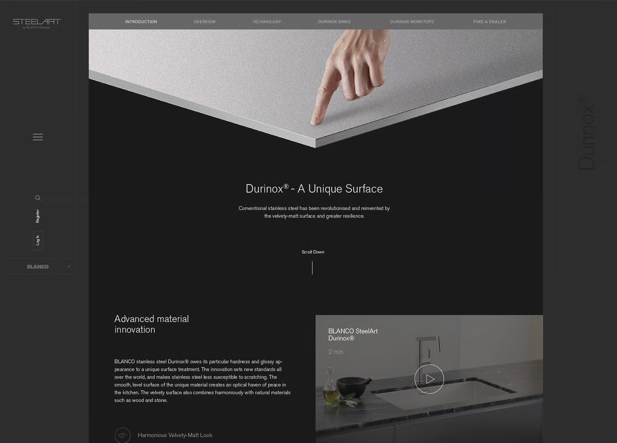
Durinox® is BLANCO’s answer to the one thing everyone knows about stainless steel: it looks perfect for about four seconds, until somebody touches it.
A surface treatment that leaves the steel velvet-matt, markedly harder, and indifferent to fingerprints. It became the centrepiece of the site’s technology story — a page built around a single fingertip — and it deserves the most honest demo we can ship on a web page. The panel below is half ordinary polish, half Durinox. Go ahead. Touch it.
Fig. 02The smudge test — one side forgives you, one side files a report
Steel sculptures for your kitchen.
// the site’s opening line — aimed at people who sketch kitchens for a living
The website’s job was never “catalogue.” As a channel it had three: catch the eye of people who are hard to impress, teach them something they didn’t know about steel, and give them a reason to come back before the next project starts.
We laid the concept out across every screen an architecture office owns, then gave each of the three jobs its own machinery.
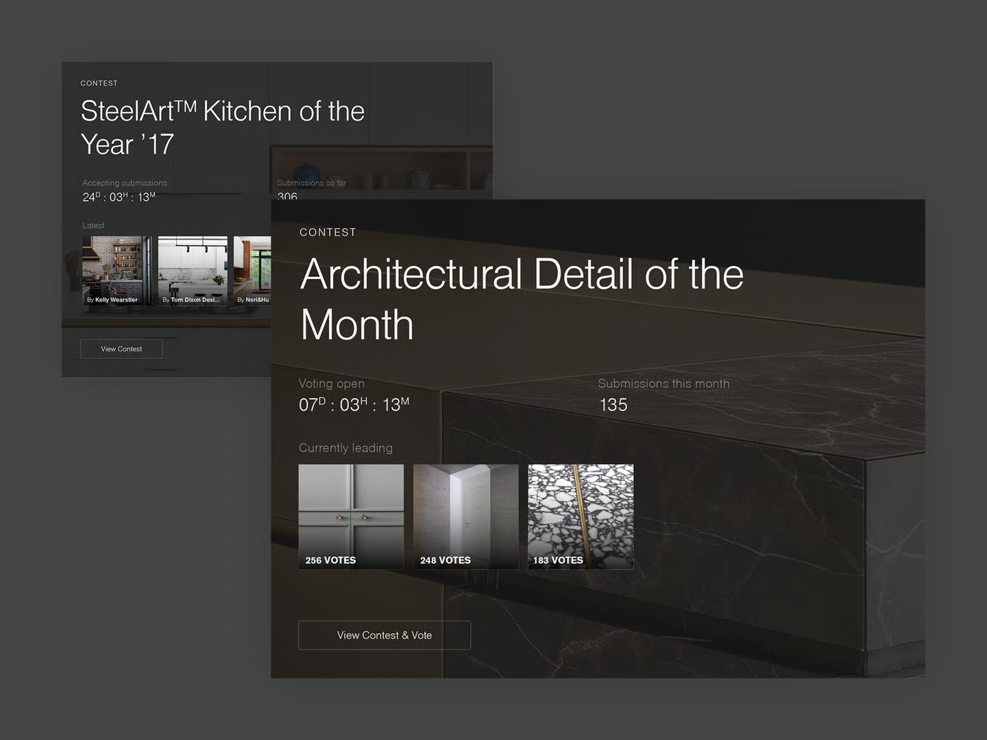
Monthly and yearly contests put working designers’ names next to the brand — Kitchen of the Year, Architectural Detail of the Month — with live counters, public voting and a leaderboard of studios worth envying. Not a banner campaign; a reason to check back that flatters exactly the right audience.
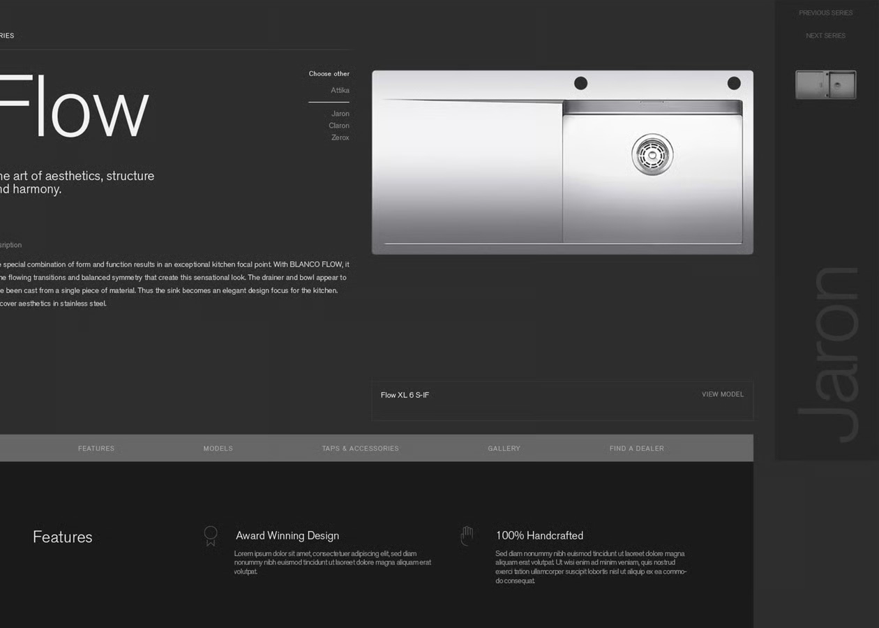
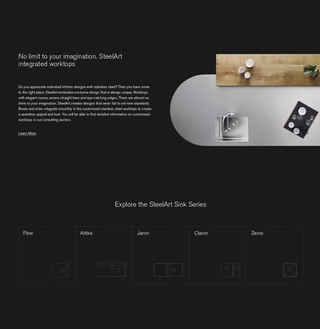
Series pages read like monographs, not SKUs — one sink family per spread, its geometry explained, its variants a footnote. The integrated-worktop pages go deeper still: bowl, drainer and worktop welded into a single seamless piece, with copy that actually tells you how.
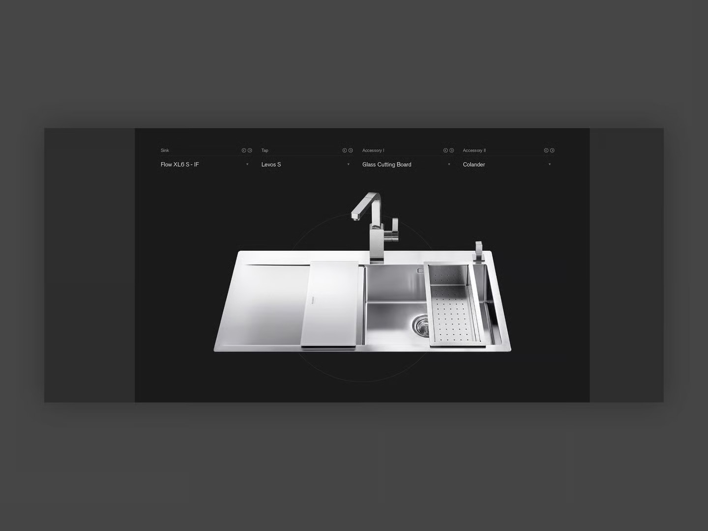
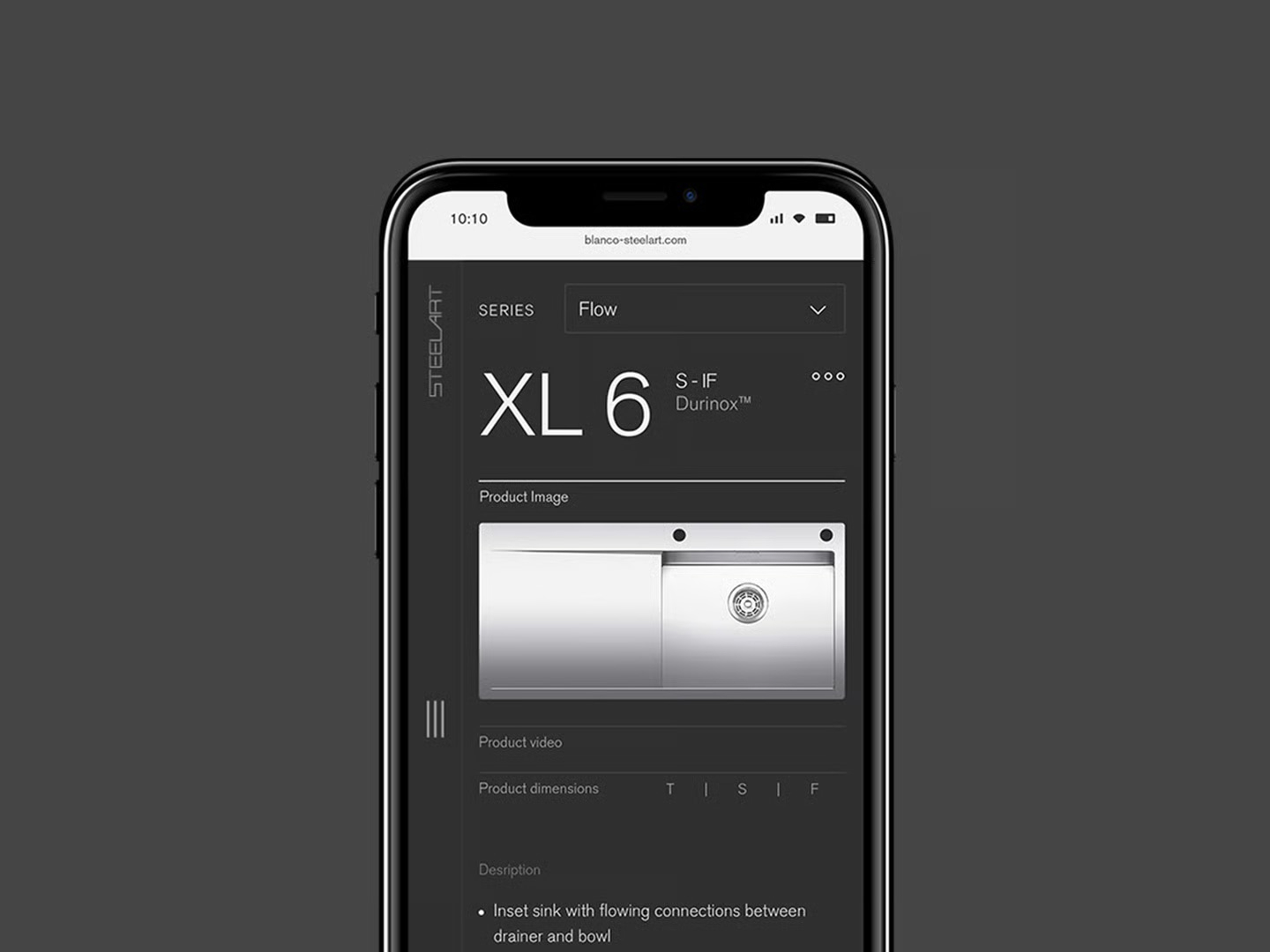
The configurator lets a designer dress a sink the way they’d spec a joinery detail — bowl, tap, cutting board, colander, swapped in place over a live product view. And because half of specification happens standing in somebody’s unfinished kitchen, the whole thing collapses politely onto a phone.
A sub-brand isn’t real until it survives off-screen. The last mile was physical — packaging, badging, the letters you find with a thumb while rinsing a cup.
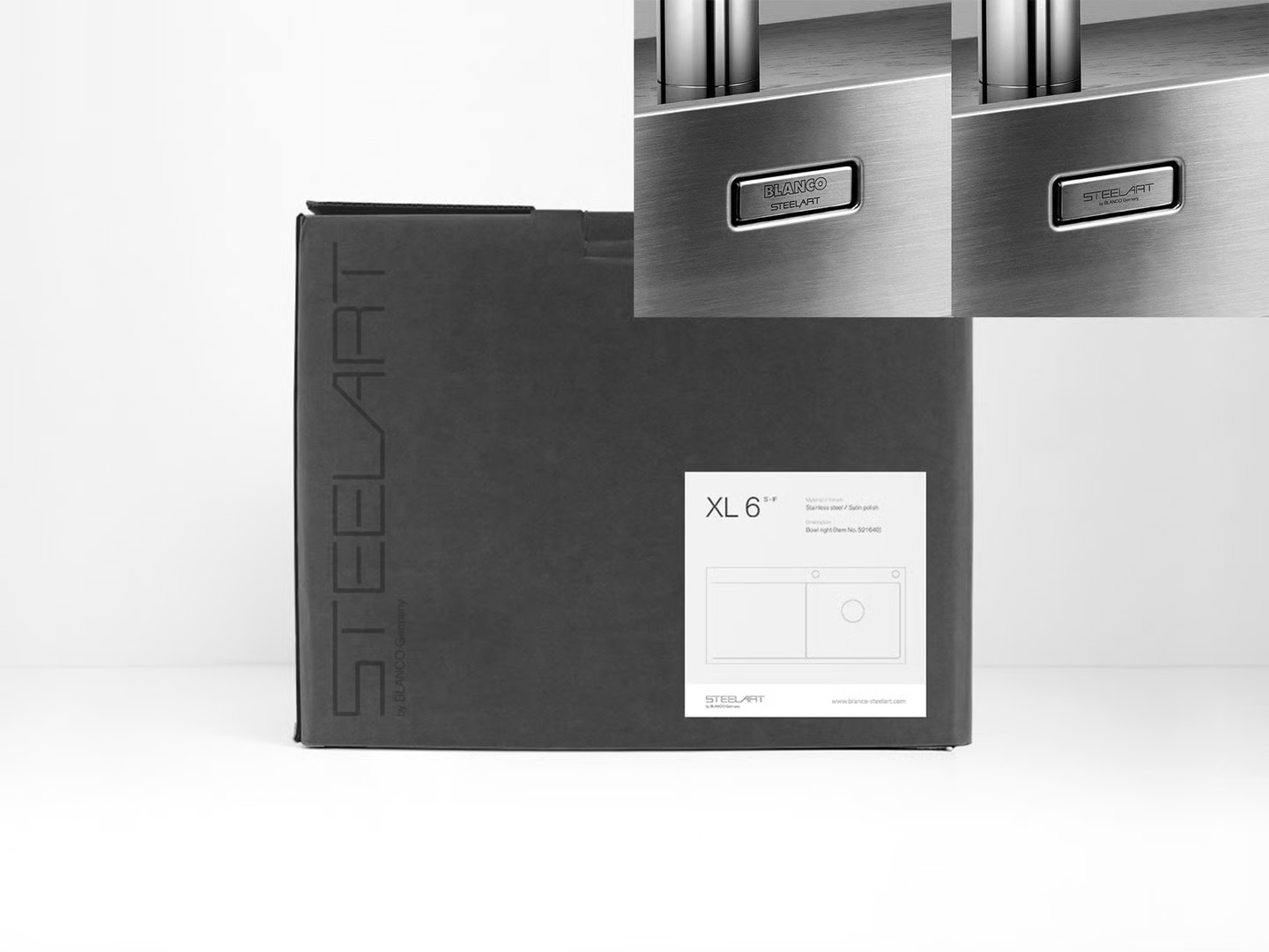
The new lockup shows up where designers actually meet the product: a matte black carton with STEELART running down its side like a book on a shelf, and a steel badge pressed into every bowl. The old badge led with BLANCO and whispered SteelArt underneath; the new one leads with STEELART and lets BLANCO vouch. Two centimetres of real estate — the entire strategy, restated in metal.
Fig. 04The material, in motion — no chrome, no controls, just steel
Some names are printed on the box.
This one is pressed into the steel.